Tuesday, September 20, 2016

Owl Be Seeing You By Judi Kauffman for The Queen’s Ink


Here’s my story and I’m sticking to it: Easy isn’t cheating! 

The four cards I designed for this post are super simple. They are flat, meant to be displayed on a small easel. If you prefer, use a folded card base.

Here’s the how-to:

1. Stamp the owl onto pages from a damaged book or onto newsprint using black, cordovan or teal ink.

Tip: If possible, choose text that goes with the stamp and position the stamped image so that you have controlled the copy that remains visible above the owl’s head as shown in the photo below. Find and tear out a quote or poem that relates to the theme, too.


2. Color the owl’s eyes with yellow and orange markers. Option: Use an opaque yellow pen to add bright yellow dots around the eyes as shown in the photo below.

3. For a Halloween card, hand-draw and cut out a 2.5” tall witch’s hat. On a 4.75” x 6.25” vertical cranberry cardstock rectangle glue down a yellow moon at the upper left (yellow cardstock circle) and trim as shown. Then glue down the owl (fussy cut along the top edge), the hat, and a mini playing card – THE QUEEN, of course! Border with black glittered cardstock.

4. For all other cards, tear around the stamped image and use a glue stick to adhere to a contrasting horizontal rectangle (shown: Cranberry cardstock 4.75” x 6.25”).

5. Option: For owls stamped in colors other than black use a black fine nib marker to reinforce the pupils and border around the eyes, as well as to accent the beak and feathers as shown below.


6. Add a single or double border to a stamped quote or the poem torn from the damaged book and position it toward the bottom right. Option: Use foam squares beneath the rectangle for added dimension.

7. Use we glue to add Gourd-Jus Prills around some of the torn edges for extra texture and color as shown below (and in the photos before and after step 2).

8. Embellish with half-pearls or with brads and spiral- or triangle-shaped paperclips.


Supplies:
  • Owl stamp (Stampendous ‘Look into My Eyes’)
  • Julia Cameron quote (RubberMoon)
  • Prills in Gourd-Jus (USArtQuest)
  • Glue stick
  • Tombow Mono Aqua glue (for Prills)
  • Inks in black, cordovan and teal
  • Newsprint
  • Pages from a damaged book
  • Cardstock in cranberry, turquoise, yellow and black glittered
  • Half-pearls in yellow and red
  • Mini playing card (Queen!)
  • Broad point or brush point markers in yellow and orange
  • Fine nib marker in black
  • Brads in red (.25”)
  • Spiral- and triangle-shaped paperclips
  • Foam dots

Tuesday, September 13, 2016

Stitchery for Mixed Media Artists – Part I, Couching By Judi Kauffman for The Queen’s Ink


A lot of mixed media artists add fibers and stitching to their projects. Have you tried it yet? I thought it would be fun to include some stitches here on the blog now and then. 

I decided to do something a little different from what you might usually see: Instead of using a piece of canvas I chose soft, recycled felt. And instead of layering on paints, collage and stenciling, I used only a single stitch – couching – and two little clusters of embellishments – polymer beads and vintage buttons, ensuring that the embroidery takes center stage. 

My goal was to keep it SUPER easy for beginners. I picked a felt envelope, a clutch-style bag with a snap closure that would be simple to sew and is available as a readymade product. 

I’m going to use it as a cover for my tablet device, but it could be a purse for a minimalist (someone who doesn’t carry everything but the kitchen sink, the way I do).


Couching is an incredibly versatile stitch. It’s one of my favorite ways to DRAW with fibers. A long thread that remains on the surface is held in place by short stitches that cross it, one at a time. The short stitches go up and down through the fabric layer (in this case the flap of the felt envelope) at intervals. These couching stitches can be perpendicular, or at an angle, evenly-spaced or randomly-spaced. It can get quite elaborate – each stitch can be studded with a bead or a more decorative stitch (not just a plain one), but that’s for down the road at some point.

I chose metallic braids for the surface threads and 6-strand cotton embroidery floss for the short stitches, using all 6 strands.

You can use much heavier fibers or much finer ones, depending on the line weight and the look you want to achieve. For example, I could have used clothesline instead of metallic braid, and held it in place with sewing thread – very heavy lines with almost invisible couching stitches to hold them in place. Or I could have held hand spun wool (knitting) yarn in place with metallic braid. The short stitches can be prominent or subtle. It’s endless!

As you will see from the close-up photos, my long (surface) threads are either single or double, sometimes the two held together for a thicker line weight and other times separated so they are thinner. Wherever they converge after forming an open shape I changed the color of the embroidery floss and put several stitches close together so that the color change resembles ‘wrapped’ threads.


When you scroll down to the final photo right before the supply list, you’ll see an unsaturated image, showing the project in black and white. It shows how the lines meander and overlap and how the main elements within the design (the LIGHTEST lines that are accented with beads and buttons) move from left to right, all the way across the flap.

The little tassels? Glad you asked! Those are knots, strategically placed at the edges of the flap to draw the eye and add a visual treat. Each piece of metallic braid is cut to about 5/8” beyond the knot and unraveled with a corsage pin! (It’s fun and fast, not at all tedious…) Metallic braid is a true ‘braid’ made with many strands. If you’re using embroidery floss, you’ll automatically have lots of strands beyond the knots.


Feel free to print out and trace the lines if you want to use my design as a pattern.

Experiment with whatever threads and fibers you have on hand. Plan the design or let it evolve. Add more knots, more embellishments – or fewer. If you don’t like what you see, use fine point embroidery scissors to trim away the parts you don’t want to keep. Felt is very forgiving. (And if you accidentally cut into the felt, not to worry – you can hide the hole with buttons, beads, a leather patch, or embroider around the hole and make it look intentional!)
Don’t want to stitch on felt? No problem. A piece of heavy muslin is a good fabric on which to practice and you could die it, paint it, stencil it, or spray it with inks if you want a colorful base layer instead of a plain neutral. Just be sure that you allow the fabric to remain relatively soft. It can be challenging (sometimes impossible...) to hand stitch through fabric that has been made stiff with layers of paint.

If there is enough interest, I’d love to teach a 'Stitchery for Mixed Media Artists' class at The Queen’s Ink! Please leave a comment here on the blog, send an email or call the store if this is something you’d like us to schedule.


Supplies:
  • Purchased or homemade gray felt clutch-style envelope (Feltables)
  • Polymer beads, buttons, or other embellishments
  • Chenille needle for embroidery floss (easy to thread long eye, sharp point)
  • Bead needle and gray sewing thread (to sew on the beads and buttons)
  • Fibers (shown: DMC 6-strand cotton embroidery floss; Kreinik #16 Medium metallic braid)


Monday, September 12, 2016

ManneqArt Masquerade... Get Your Tickets Now!


ManneqART is an international arts and education non-profit that inspires creativity, teaches problem solving skills, and rewards excellence in Sculpture on the Human Form. The organization is focused on bringing Wearable Art to the attention of the American public, through a variety of events during the year. The focal point of our season is a Public Display of exceptional designs culminating in a Gala Event where finalists present their work and receive awards. This year's Gala is sure to be full of spectacular art candy, so order your tickets now. The Queen (a.k.a. Patti) has an entry in this year's exhibit, as well as Royal Customers Ann Hoover, Sherry Kirn, and Sharon Garry. Many of the 2016 entries are now on public display, and will be on display at the Masquerade, where award winners will be honored.


Friday, September 9, 2016

Announcement: Royal Mixed Media Art Retreat - May 2017


Costa Rica provides the ultimate blend of tranquility and excitement and the perfect setting for inspiration. We are returning to this enchanted Paradise and hope you will decide to join us for 7 nights and 6 days as we create art, explore, and re-energize in this tropical haven far away from the stress and demands of daily life. Patti Euler, Kristen Powers, and Terry Quinn will be your hosts again this year and they have planned a week full of unique mixed media workshops designed specifically for this venue, all of them included in your package. 

We are extremely excited to announce that we have a special guest artist joining us this year. One of Costa Rica’s premier artists, Jacques Quillery has agreed to help us refine our painting techniques  and teach a one day acrylic painting class. Jacques will be sharing his approach to painting Costa Rica flora and landscapes and his use of  bold tropical colors. This is an amazing opportunity, and we feel a major highlight of our retreat. You can check out some of Jacques’ work at www.costaricangallery.com.


All of our mixed media art projects have been designed so that you will complete them before you leave. Throughout the week there will be plenty of open studio time allowing you to continue creating, and we promise there will be plenty of time to schedule excursions, go shopping, or explore the outdoors and nature at its finest. Zip lining not your thing? Relax on the beach, take a dip in the pool, or indulge in a massage or facial at the OnZen Spa. There’s plenty to see and do in Costa Rica. Pura Vida!

For complete package information including rates and other important details, and registration, please read the Retreat Flyer.                                            

Tuesday, September 6, 2016

Shimmer Sheetz Birds By Judi Kauffman for The Queen’s Ink


I love the look of feathers and use them often for cards, gift tags, decorations and such. They’re so colorful and upbeat. If you’ve been following this blog for a while you may have noticed that my first Guest Designer project included a card with a feathered crown. If you missed it, scroll through the archive when you get a minute…

This time I’ve used 4” blunt-cut feathers for the tails on a pair of whimsical sparkly birds. The birds began, as projects often do, when I looked down at some scraps sitting on my work table and saw something other than random scraps. In this case it was embossed Black Iridescent and Basic Black Shimmer Sheetz pieces, leftovers from a mosaic I’d made.

One thing led to another. The muse whispered in my ear and said, “Make some birds!” I listened…

Instructions:

1. Cut a randomly-shaped wonky 4-sided shape for each bird’s body and a 4-sided wing piece with one of the long sides curved instead of straight. The curved side is the top of the wing. Adhere these layers onto the card front, adding dimension with small pieces cut from Power Tabs. Design Detour: I cut each Tab into four strips. A little goes a long way.

2. Add a glittered cardstock triangle for the beak and a button for the eye. Use a button with two holes and tie the black cord so the knot is visible on the front (top side) of the button. The cord is purely decorative. Use a snippet of a Power Tab to secure the button.

3. Create legs and feet with paper-covered wire and a teardrop-shaped bead. Design Detour: These were part of a floral pick a friend gave me – someone who knows I can’t resist a shiny object! If you can’t find paper-covered wire use knotted cord. (Knot once at the ankle to secure the bead and again to create a knee, and once more at the top where the leg gets tucked under the bird’s body.)


4. Add the tail feather using another snippet of a Power Tab to secure it behind the bird’s body.

5. To finish the card fronts, create a ground line or simply add a sentiment toward the top (or both!). I cut a leftover strip from the top of a newsprint pad for the ‘grass’ below one of the birds and put die cut wildflowers into its beak. (Both the wildflowers and the newsprint pad strip have appeared in previous projects – more leftovers put to use!) I added a glittered cardstock die cut sentiment to the other card. Design Detour: Back the cardstock with double-sided adhesive before cutting the sentiment – no wet glue needed with that method.


Design Strategies:

The cards are 6” square with a top fold. The size of your bird/feather combo will determine the dimensions of your card. Vary as you choose! Tiny birds would be great on gift tags or Artist Trading Cards. Design Detour: For these, you’ll need a larger envelope for mailing because the tails and wildflowers extend past the top edge. Protect the card with a sheet of paper so the feather and die cut pieces won’t get bent in transit.

My color choices for the birds were accidental, but it was a happy accident. Black Iridescent Shimmer Sheetz reflects various other colors including yellow, blue, pink, and purple (kind of like the feathers on a crow), while Basic Black is shiny black like patent leather. Change to any two colors you want, or make the body and wing out of the same one! Design Detour: If you want to slightly tone down the shine of the Shimmer Sheetz, lightly sand the surface. The ‘core’ color will be revealed when sanded.

Play with embossing folders. I stuck with an allover pattern because I was using scraps, but you could go for wavy lines or any other design that looks ‘birdlike’ to your eye.

Instead of a button for the eye, switch to a die cut circle with a gem in the middle, a round sticker, a rusty washer, or something else.

If you don’t have gold notary seals to cut in half and pleat for the crests, die cut a small zig-zag edge or scalloped edge circle out of lightweight gold paper, cut it in half and pleat one half for each crest.

If you don’t have the wildflower dies, use actual pressed flowers from a nature walk!

If you prefer not to use real feathers, hand- or die-cut your own or stamp some.

Supplies:
  • Shimmer Sheetz in one or two colors (Shown: Black Iridescent, Basic Black)
  • Embossing folder of choice
  • Embossing/die cutting machine of choice
  • 4” Feathers or feathers sized to fit the birds you create
  • Tombow Power Adhesive Tabs
  • Gold notary seals
  • Buttons, black cord (for eyes)
  • Tim Holtz Wildflowers dies
  • Die for a sentiment (Shown: Congrats by Suzanne Cannon, A Way With Words Collection)
  • Double sided adhesive sheet for backing sentiment prior to cutting
  • White cardstock for wildflowers
  • Glittered cardstock (Shown: Purple/card base; Orange/beaks; Pink/sentiment)


Tuesday, August 30, 2016

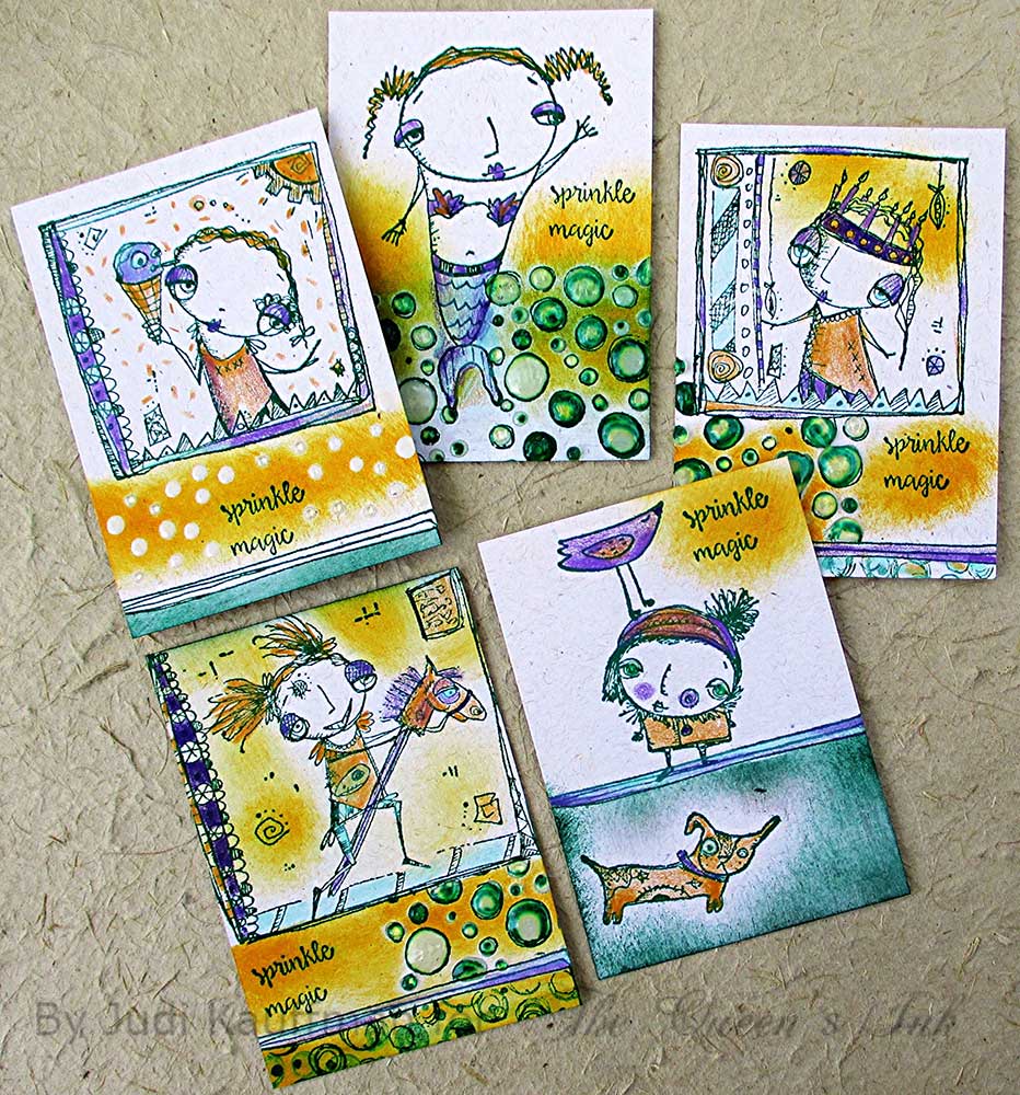
Mermaids & More – Ten ATCs By Judi Kauffman for The Queen's Ink


One of the things I hope to accomplish with my blog posts here at The Queen’s Inkling is to showcase the versatility of the stamps and other supplies I use. Therefore, you’ll often recognize something you’ve seen in past projects!


For example:

Two weeks ago I incorporated a Rubbermoon stamp that says ‘Best Day Ever!’ into a series of torn paper collage Artist Trading Cards. This time its back as part of a trio of envelopes (one of them shown above) as well as providing some decorative linear elements for the ATCs. I inked up only the lines from above the text (shown below).


Last week I used the Shrine Top stamp as a head for some quirky figures and as a decorative element on a trio of cards. This week, it shows up turned upside down as a table on which a small figure stands, to the right on the envelope shown below.


This week I’m introducing more whimsical and wonderful Rubbermoon stamps - a mermaid, dog, bubbles, and more! Yes. I’m definitely a big time fan of this company’s images. Not to worry – Patti Euler, owner of The Queen’s Ink, will do her best to keep them in stock so blog followers can find them in the store or order over the phone.

And even though I designed ATCs only two weeks ago, I’m revisiting them, this time as simple ‘stamp and color’ projects. Such an easy and fast way to experiment – not too time consuming and SO much fun!

INSTRUCTIONS
If you are an experienced paper crafter, use the photos as inspiration and head straight to the supply list. If you’re new to stamping and want to create ATCs that look just like mine, please follow the steps below. Design Detours in italic font provide extra information and tips.

1. Cut an 8.5” x 11” piece of light tan cardstock into ATC-size pieces as follows: Cut two 2.5” wide strips and one 5.3” wide strip. Cut each of the 2.5” strips into three 3.5” long pieces. Cut the 3.5” wide strips into four 2.5” high pieces. Voila! Ten ATCs waiting to decorate…


2. Stamp a little scene on each rectangle. Use the same color ink and an artist’s sponge to smudge a bit of color here and there. Also smudge a contrasting color on some or all of the ATCs (I used bright yellow on one set of five). Design Detour: I stamped five pairs with two of the same composition on each pair, but it could have been ten different ones, or all ten alike. Vary as you choose! All of my ATCs are vertical rectangles, but yours don’t have to be.


3. Add dimensional glaze to selected areas of the ATCs, as shown above, and set aside to dry. Design Detour: I did this for one set of five ATCs, adding dimension and sparkle to the stamped bubbles, to the eyes of one of the figures and the dog, and to the area around the words ‘Sprinkle Magic’.


4. Color with pencils or markers. Design Detour: I used colored pencils with soft blends for the five ATCs with dimensional elements, shown above. I used alcohol-based markers for the other five, shown below – lots of bright colors.


5. Here are close-ups of the pairs to show how the choice of coloring medium can totally change the look:


6. Keep going…Stamp card fronts, bookmarks, gift tags, place cards – and don’t forget about the envelopes! Two were shown toward the start of this post, my third one is below. Design Detour: Hunt for stamps that coordinate with the stamping. The US Forever ‘Pets’ stamps are just perfect.


SUPPLIES
  • Rubbermoon stamps
  • Bright green ink
  • Bright yellow ink
  • Light tan cardstock
  • Paper trimmer
  • Dimensional glaze
  • Colored pencils (Prismacolor, shown, or brand of choice)
  • Alcohol-based markers
  • Artist’s sponge


Tuesday, August 23, 2016

Over the Moon for Rubbermoon! By Judi Kauffman for The Queen's Ink


I’ve been a fan of Rubbermoon stamps for many years. When I walked into The Queen’s Ink on August 6th to teach a class the display table just inside the door stopped me in my tracks. It was filled with Rubbermoon stamps! Before I’d even put down my tote bag and started set-up I went SHOPPING. (You know how that goes…)

The two stamps I chose for today’s projects were the first ones I picked up, though at the time I didn’t have an Inkling (pun intended) that I would soon combine them.

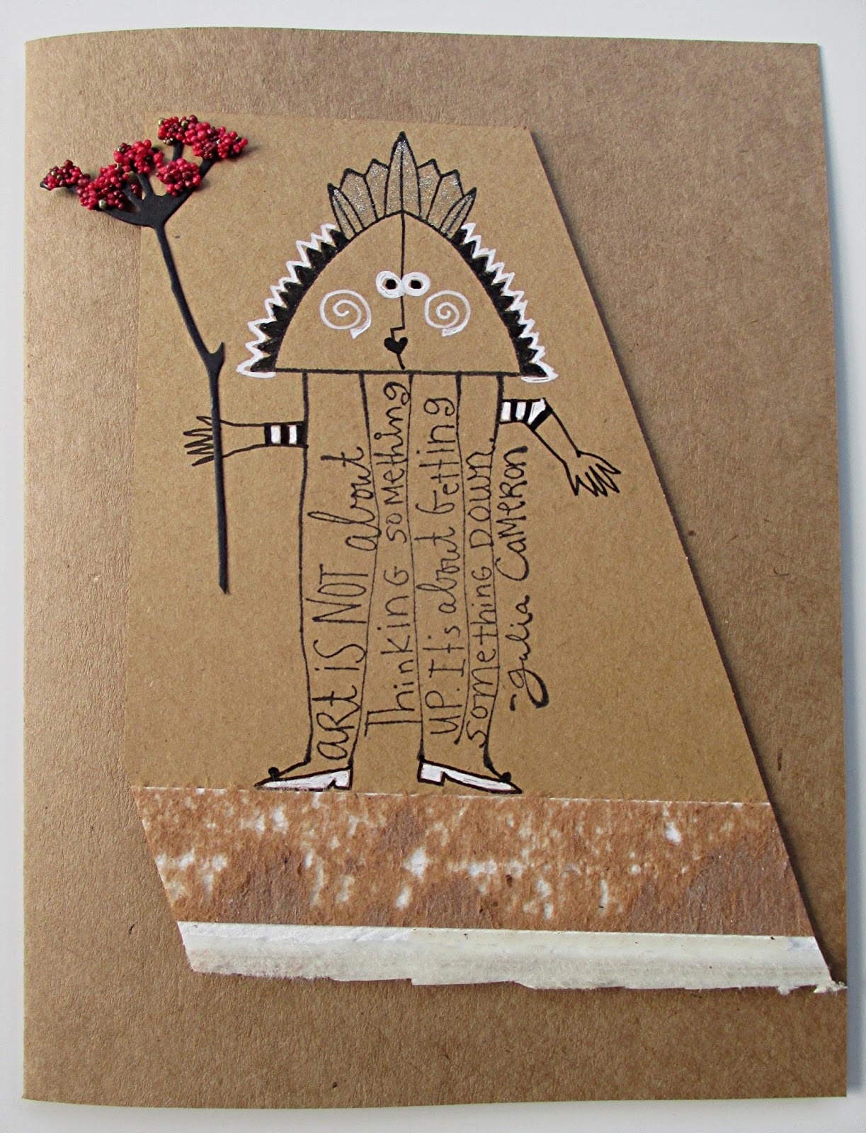
As always, one thing led to another. I stamped the Julia Cameron quote sideways on an envelope so the post office wouldn’t get confused by the text. All of a sudden it looked like a person. Bingo! I got out the Shrine Top and a figure appeared. A few quick doodles for feet, hands and face and the envelope was on its way…

This fun discovery led to cards with sideways-quote figures. Two of them are shown below.

While I was at it I made another one with a more traditional look, shown below.


RECIPE FOR THE CARDS:

Use the samples as a starting point. Duplicate them as shown or head in your own direction!

Combine two or more stamps in an unexpected manner. Design Detour: Turning a stamp sideways or upside down will help you see it in a totally new way.

Add in some scraps, do a bit of layering and collage with torn or cut pieces. Design Detour: The fuzzy pieces on the cards are leftovers from a newsprint pad (the strip that connects the front and back covers and secures the individual sheets).

Doodle, draw and color as shown or as you choose. Design Detour: Stamp a LOT of images so you can practice drawing the faces, arms and hands, feet, or anything else you want to add. Use glued-on collage or additional stamping instead of drawing if you prefer.

Mix in some die cut wildflowers (leftovers from the WildflowerTags published in The Queen’s Inkling on August 2, 2016).

Top it all off with embossing powder, flocking, micro beads, or another dimensional texture in selected areas. Design Detour: I used clear-drying Tombow Mono Aqua Liquid Glue topped with US ArtQuest ‘Berry Nice’ Prills, a jar full of fun...lot of colors and sizes in one mix.


Stick to a limited color palette. Design Detour: I worked with Kraft brown, grayish brown, and reddish brown cardstock and chipboard, plus red, white, and black. There are specks of gold in the Prills and I colored parts of the Shrine Top with a clear glitter pen.

SUPPLIES
  • Rubbermoon stamps: Shrine Top and Julia Cameron Quote
  • Black ink pad
  • Sakura Gelly Roll Medium in White and Stardust in Clear
  • Sakura Pigma Micron 01 in Black
  • Sizzix Tim Holtz Wildflowers die set
  • Clear drying glue
  • US ArtQuest Prills in Berry Nice (or other texture medium – micro beads, embossing powder, flocking powder, etc.)
  • Assorted cardstock, chipboard, folders, or envelopes in shades of brown and gray