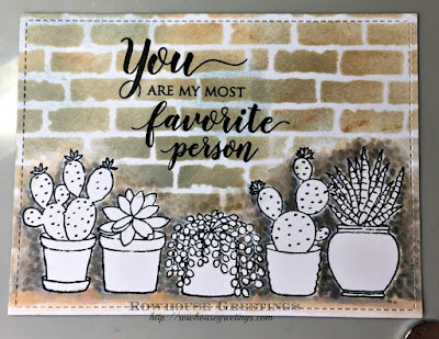
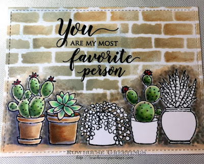
So I pulled out a new stamp in my stash - Happy Together by Penny Black - and decided to color the image of the potted cacti. I wish I had taken photos while I was coloring, but frankly I wasn't really sure where I was going with this and the coloring just evolved along the way. After stamping the images with Memento Ink, I drew a cast shadow along each of the cacti and pots in BV20 and BV23, but changed my mind and decided to add stippling in W1, W3, W5, and E30. However, I looked at that big expanse of white above the stamped image and decided that I had to turn this image into some sort of scene.
Next, I had to decide on the color scheme for the plants. I debated using bright colors, but decided to stick to a softer, more subtle color scheme. I first colored the two terracotta pots in E30, E31, E33, E35, and E57. I decided that I'd use G40, G43, and G46 for the first cactus, repeating the combination on the other similar cacti. I decided that I wanted to go a little darker for more contrast so I added G85 to the blend. I left a white line around the inside edge of the image as a highlight that I later colored with G20, R00, and Y02 to add highlights. A little R32 and R35 on the flowers provided a pop of color.
For the second plant, I base coated the leaves with YG11, gradually working darker with G00, G02, and adding highlights with Y02 and V000.
I decided that I wanted another pop of color so I used R000, R00, R01, and R02 to color the center pot. I later added R05 to deepen the color and a little Y02 to brighten the highlight. For the plant I used YG11 and BG72, a combination that I probably wouldn't use over a large area, but worked here to depict a highlight and a contrasting low light. I randomly added Y02 to brighten the colors.
The fourth pot reminded me of one that I've seen in my local gardening center which for some reason is only ever available in aqua so I used BG000, B000, BG01, and BG02. I used BV01 and BV02 to add depth and to emphasize the pattern on the pot.
I decided that I wanted the fifth pot to be a burnished gold color so I used Y21, Y23, Y26, and Y28 to achieve the golden color. It's hard to achieve depth when coloring with yellow, so I overpainted the yellow with BV01 and BV02 to add some depth, accentuating the curve of the pot. The final plant was colored using G40, G43, and G46, adding Y02 and R01 to the highlights.
I tried to repeat colors across the entire image to provide some continuity. With that in mind, I swept a little E20, Y02, and R00 randomly on the stenciled bricks to tie the Distress Ink shades into the Copic colors.
After the main coloring was complete, I used BV20 and BV23 to add cast shadows and to deepen areas that needed to recede into the background. A little BV00 on the terracotta pots added a bit of a weathered look to the surface.
And here's the finished product!
It took me several hours (and a lot of markers!) to complete this card, but I think the time and effort was worth it in the end. Hope my project inspires you to try something new!
Supplies
Stamps: Happy Together (*) by Penny Black; Grateful Heart (*) by Penny BlackInks: Memento in Tuxedo Black by Tsukineko; Versafine in Onyx Black by Tsukineko; Distress Ink by Tim Holtz in Weathered Wood, Tea Dye, and Pumice Stone.
Dies: Small Stitched Rectangle Stackables by Lawn Fawn; Zig Zag Rectangle Stackables by Lawn Fawn
Stencil: Layering Stencil - Bricked by Stamper's Anonymous Tim Holtz
Copics: BV01, BV02, BV20, BV23, V000, R000, R00, R01, R02, R05, R32, R35, Y02, Y21, Y23, Y26, Y28, YG11, G00, G02, G20, G40, G43, G46, G85, BG000, BG01, BG02, BG72, B000, E30, E31, E33, E35, E57, W1, W3, W5


No comments:
Post a Comment