Sunday, April 29, 2018

Cats and Butterflies: Card-in-a-Box and Envelopes by Judi Kauffman for The Queen’s Ink


I am crazy about Card-in-a-Box projects. They’re so much fun to make, impressive but easy. They fold flat for mailing. Unless the embellishments are heavy or extra thick, they don’t even require a special envelope or extra postage! 

I am also crazy about Laurel Burch stamps. I keep adding to my collection. And whenever there is a matching die set, that goes into my basket, too. (It’s all Patti’s fault! She keeps ordering them and I can’t resist…)

And while we’re talking about my favorite things, I love decorating envelopes.

Put it all together and what do you get? Today’s blog post! Mix the cats with the butterflies, or not. Color the butterflies, or not. Incorporate stamps you already own, or not. Before you know it, you’ll have a batch of cards for birthdays and other occasions. Matching envelopes? Of course!

Do some stamping, coloring, die cutting and fussy cutting. Arrange and rearrange the elements till you like what you see, then glue everything in place as shown or as you prefer… I have two dividers (cross-bars) in my cards but you can fit in more if you’d like. For added stability, I use an extra layer on the back of the upright panel as shown in the one back-view photo in the gallery that follows.

Use these photos and the two at the start of the blog post for inspiration or duplicate the cards if you prefer. A supply list follows the pictures.


SUPPLIES
  • Laurel Burch stamps and matching dies available at The Queen’s Ink (Stampendous
  • Sentiment stamps
  • Inkpads in colors of choice
  • Markers
  • Colored pencils
  • Gold paint pen
  • White opaque ink pen
  • Double-sided adhesive tape
  • Tombow Xtreme Adhesive Tabs
  • Non-stick scissors to cut Tabs
  • Cardstock in solid colors
  • Scrapbook papers
  • Envelopes
  • Wire
  • Washi tape
  • Card-in-a-Box die or template
  • Assorted die cuts (hearts, oval frame, wildflowers)

Monday, April 23, 2018

Brushstroke Backgrounds Part Two by Judi Kauffman for The Queen’s Ink


As promised, I used the pieces of cardstock from Brushwork Backgrounds Part One to create a series of cards! I had considered doing further alterations on the rectangles – stenciling, drawing and such, and then decided to leave them as they were. 

I did, however, do a lot of cutting and piecing, layering, embellishment, stitching and collage. I included some favorite stamps of mine - the Laurel Burch Blossoming Woman and Imagine Butterflies, colored and fussy-cut for an oversized card/wall panel.

If you missed Part One of the Brushstrokes tutorial, click on the link to the right of this post under the "Recent Posts" heading.

I incorporated speckled cardstock in red, white, black and mustard (mustard used for the face and butterflies), along with some flocked and embossed scrapbook papers. Among the additions are chipboard flourishes, pieces torn from a cast-off book printed in Russian (I sure hope I didn’t accidentally use something political or off-color!), glitter dot peel-offs, staples, a paper flower, some orange iridescent Shimmer Sheetz circles, heavy twine and staples (two sizes: standard and Tim Holtz’s Tiny Attacher).


To hold things together I chose foam squares for dimension and double-sided adhesive tape for everything else.

To follow are more photos of projects to help kick-start your own Brushstroke Backgrounds projects. If you’d like to see a Brushstroke Backgrounds Part Three, please leave a comment and I’ll keep going!


SUPPLIES

  • Blossoming Woman (Stampendous)
  • Imagine Butterflies (Stampendous)
  • Permanent black ink
  • Markers
  • Colored pencils
  • Cardstock in red, white, black, and mustard
  • White acrylic paint
  • Wide, stiff paintbrush
  • Foam squares or tape
  • Double-sided adhesive tape
  • Glitter dots peel-offs (Elizabeth Craft Design)
  • Assorted embellishments
  • Staplers
  • Twine
  • Awl (to pierce holes for twine)

Thursday, April 19, 2018

Copics and Stencils and Stamping! Oh my!

I've been doing a lot of coloring lately in preparation for upcoming classes, but a few days ago, I took time today to step back and focus on expanding my own range and skills. Recently, I've been experimenting with creating backgrounds using stencils, embossing powders, distress inks, and various other media. This is a big step for me - my card designs have always been so pared down that adding sequins was as close as I ever came to mixed media. But I'm intrigued by all the new embellishing, embossing, and texturing products coming on the market and decided it was time to start incorporating them into my projects.

So I pulled out a new stamp in my stash - Happy Together by Penny Black - and decided to color the image of the potted cacti. I wish I had taken photos while I was coloring, but frankly I wasn't really sure where I was going with this and the coloring just evolved along the way. After stamping the images with Memento Ink, I drew a cast shadow along each of the cacti and pots in BV20 and BV23, but changed my mind and decided to add stippling in W1, W3, W5, and E30. However, I looked at that big expanse of white above the stamped image and decided that I had to turn this image into some sort of scene.

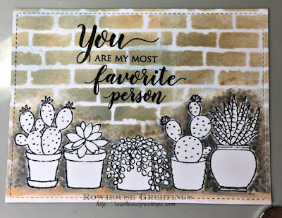
My new love affair with texture pastes has resulted in the purchase of several new stencils. It happened that one of my recent purchases included the Bricked stencil by Tim Holtz. I taped the stencil in place and used Distress Inks in Tea Dye and Pumice Stone to create the pattern. I got as close as I could to the plants without overlapping them with the stencil pattern. After I removed the stencil, I used my blending tool to lightly sweep a little Weathered Wood to soften the remaining white background of the card stock. I blended out the earlier stipling with W1, W3, and E30 to merge into the bricks, combining the earlier background attempt and the new stenciling into one coherent scene. At this point, I was pretty pleased with myself and actually did take an interim photograph shown below.


I debated adding a little texture paste to the stencil, but I wasn't sure how it would react with the X-Press It Blending Card that I had used when I stamped the image. While I'm the first to say "it's just paper," I felt that I was too far along at this point for that level of experimentation. So I'm saving the texture paste for another project.

Next, I had to decide on the color scheme for the plants. I debated using bright colors, but decided to stick to a softer, more subtle color scheme. I first colored the two terracotta pots in E30, E31, E33, E35, and E57. I decided that I'd use G40, G43, and G46 for the first cactus, repeating the combination on the other similar cacti. I decided that I wanted to go a little darker for more contrast so I added G85 to the blend. I left a white line around the inside edge of the image as a highlight that I later colored with G20, R00, and Y02 to add highlights. A little R32 and R35 on the flowers provided a pop of color.


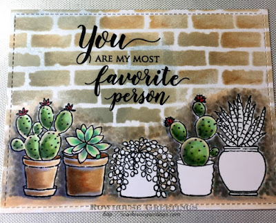
For the second plant, I base coated the leaves with YG11, gradually working darker with G00, G02, and adding highlights with Y02 and V000.

I decided that I wanted another pop of color so I used R000, R00, R01, and R02 to color the center pot. I later added R05 to deepen the color and a little Y02 to brighten the highlight. For the plant I used YG11 and BG72, a combination that I probably wouldn't use over a large area, but worked here to depict a highlight and a contrasting low light. I randomly added Y02 to brighten the colors.
The fourth pot reminded me of one that I've seen in my local gardening center which for some reason is only ever available in aqua so I used BG000, B000, BG01, and BG02. I used BV01 and BV02 to add depth and to emphasize the pattern on the pot.

I decided that I wanted the fifth pot to be a burnished gold color so I used Y21, Y23, Y26, and Y28 to achieve the golden color. It's hard to achieve depth when coloring with yellow, so I overpainted the yellow with BV01 and BV02 to add some depth, accentuating the curve of the pot. The final plant was colored using G40, G43, and G46, adding Y02 and R01 to the highlights.
I tried to repeat colors across the entire image to provide some continuity. With that in mind, I swept a little E20, Y02, and R00 randomly on the stenciled bricks to tie the Distress Ink shades into the Copic colors.

After the main coloring was complete, I used BV20 and BV23 to add cast shadows and to deepen areas that needed to recede into the background. A little BV00 on the terracotta pots added a bit of a weathered look to the surface.

And here's the finished product!

It took me several hours (and a lot of markers!) to complete this card, but I think the time and effort was worth it in the end. Hope my project inspires you to try something new!

Supplies

Stamps: Happy Together (*) by Penny Black; Grateful Heart (*) by Penny Black
Inks: Memento in Tuxedo Black by Tsukineko; Versafine in Onyx Black by Tsukineko; Distress Ink by Tim Holtz in Weathered Wood, Tea Dye, and Pumice Stone.
Dies: Small Stitched Rectangle Stackables by Lawn Fawn; Zig Zag Rectangle Stackables by Lawn Fawn
Stencil: Layering Stencil - Bricked by Stamper's Anonymous Tim Holtz
Copics: BV01, BV02, BV20, BV23, V000, R000, R00, R01, R02, R05, R32, R35, Y02, Y21, Y23, Y26, Y28, YG11, G00, G02, G20, G40, G43, G46, G85, BG000, BG01, BG02, BG72, B000, E30, E31, E33, E35, E57, W1, W3, W5

Wednesday, April 18, 2018

New Class! Copics, Stencils and Distress Inks - May 1st, 2018 at the Queen's Ink

I'm returning to the The Queen's Ink on Tuesday, May 1st to teach a Copic marker class featuring stamps from Stampers Anonymous / Tim Holtz. In this class, the emphasis will be on creating simple backgrounds to compliment your Copic coloring. Details are below. All necessary techniques are taught in class. Seats are limited, so sign up today! CLASS FEE: $25

The Queen’s Ink
Savage Mill Box 2048 | 8600 Foundry Street | Savage, Maryland 20763
phone: (301) 497-9449 | website: https://queensink.com

Tuesday, May 1, 2018, 1:00 PM - 3:30 PM
Tuesday, May 1, 2018, 6:00 PM - 8:30 PM

To register, call the Queen's Ink at (301) 497-9449

BRING TO CLASS: The list below reflects the Copic markers that I will use in class. You can follow along using the same colors OR substitute colors based upon your personal Copic collection. Please bring all your markers to class and make sure your Copics are marked with Washi tape or some other means of identification. Markers are available for purchase at The Queen’s Ink. Students will receive a 10% discount on Copic markers. I will be available prior to class to help with selection.

PLEASE NOTE: You must bring your own markers to participate in class. If you need markers, please contact The Queen's Ink in advance of class. If you wait until class time, you may not be able to purchase the markers you need.
  • Y02: Canary Yellow
  • Y32: Cashmere
  • Y35: Maize
  • Y38: Honey
  • R32: Peach
  • R35: Coral
  • B32: Pale Blue
  • B34: Manganese Blue
  • BG000: Pale Aqua
  • E21: Soft Sun
  • E25: Caribe Cocoa
  • 0: Colorless Blender
OTHER SUPPLIES: Please bring 2-3 ink blending tools and clean foam refills (such as Ranger Mini Ink Blending Tools / Foam Refills), liquid glue that dries clear (such as Ranger Multi Medium Matte), scissors suitable for fussy cutting, foam adhesive squares, and a tape runner adhesive or double-sided tape.


Sunday, April 15, 2018

Laurel Burch Blossoming Woman Window Card by Judi Kauffman for The Queen’s Ink

Window cards are such fun and so easy! Simply fold a long strip of cardstock in thirds, hand- or die-cut a window in the middle section (this section becomes the card front), glue something behind the window opening, fold in one of the side panels to line the card front and the other side panel becomes the inside/back.

If you're going to do a lot of stamping or stenciling, don't put anything behind the window until all panels are finished. It's much easier to work when the long sheet is still flat.


This project is a tad narrower than standard A2 size when folded. Each panel is 4” wide rather than 4.25” (the usual A2 width) but is the standard 5.5” height. You can make two window cards from one 12” x 12” sheet of cardstock!

The photo below shows the inside of the card with the panel on the left glued behind the window panel. (Look closely and you'll see where the cut edge meets the fold to the left of the large butterfly.)
This is an ‘FYI’ project: For Your Inspiration! No instructions this time since I think the photos tell the entire story – I used black ink, markers, and cardstock in three colors (one for the card, one for the face, and one for the sentiment). The face is fussy-cut and backed with cork pattern paper.
I used colored pencils for eye shadow and to highlight the woman’s nose. To unify everything and tone it down a bit, I used a stiff-bristle brush to streak on some white paint.

At the time this project was completed, all cling-mounted rubber stamps were in stock at The Queen’s Ink. If you’re looking at this someday as part of the blog archive that might not be the case, but if the stamps haven’t been discontinued they can be special ordered! A side note: There are matching die sets for each of the stamp sets.

SUPPLIES

  • Laurel Burch Blossoming Woman (face) – Stampendous
  • Laurel Burch Imagine Butterflies (butterflies) – Stampendous 
  • Laurel Burch Magical Horses (sentiment stamp) – Stampendous
  • Black ink
  • Markers of choice
  • Colored pencils of choice
  • White gel pen
  • White acrylic paint
  • Stiff paintbrush
  • Square cutting die (2”) or craft knife, ruler, and cutting mat

Saturday, April 7, 2018

Brushstroke Backgrounds Part One by Judi Kauffman for The Queen’s Ink


I have a friend who swears that she has 10,000 backgrounds in her studio, that she likes making them more than using them! I know how she feels. Making gel prints and interesting sheets filled with textures and patterns is so much fun – no agenda, nothing planned, just playful puttering.

So that I can add to my own stash of background papers (under a hundred, I think, but I haven’t counted lately. Or ever…) I’ve gotten in the habit of keeping a stack of quarter-sheets of cardstock on my work table and instead of wiping paintbrushes on a paper towel before washing them I wipe them on the cardstock sheets. I also keep narrow scraps of cardstock and wipe paint onto them while I’m at it.


What do I do with these instant backgrounds? I use them for card fronts, I die cut them, tear them into pieces, make ATCs, incorporate them into collage.

I start with a mix of light and dark color cardstock, allowing the swaths of paint to produce high contrast textures as well as tone-on-tone. I rarely add more than two or three layers of paint because I like the color of the cardstock to remain visible, but now and then I end up with a totally paint-encrusted surface.

Sometimes I keep going, adding stenciling, stamping (ArtFoamies stamps work great!), and layers of torn paper before I declare a background ‘done’.

Now and then what began as a background turns into a fully realized collage, a small piece of art.

Options:
Instead of cleaning your brushes on solid color cardstock, start with patterned paper, pages from damaged books, or gel prints.

Instead of using only the paint that is left over from other projects, put out small amounts of paint and make it an intentional project – but keep the brush almost dry and use very little paint!

YOUR TURN


I would like to challenge you to give this a try some time in April and then leave a comment here on the blog to share what you liked or didn’t like about making Brushstroke Backgrounds.

Today’s ‘show and tell’ is merely a starting point. Tune in later this month to see what evolves when we post Brushstroke Backgrounds Part Two. I’m going to work on a batch of cards.

SUPPLIES

  • Cardstock
  • Acrylic paint
  • Paintbrushes